top of page
wopuchi
tin can label
2020
for this project, we were tasked to create a tin can label design of a particular product of our choice.
i chose canned luncheon meat.
the name wopuchi is a contraction of what my niece often call my mother "Wowa Puchi".
the name aling cory's was inspired by 'Ate Cory', the woman who sold macaroni spaghetti, champorado, and pancit bihon for breakfast across our 'eskinita' in tondo from 3am-6am during my primary education years.
i made this project as close to my heart as i can.
good food is something we all connect and agree with. it can create wonderful relationships, and could even mend broken ones.
there's this notion that canned goods aren't as good as home cooked food. i beg to differ.
the essence of this project was to apply in its label design my image of good food. and so i applied retro and dated design elements - elements that are familiar and known by many, to emulate a sense of nostalgia and familiarity. it would also make the product look like it existed for more than a decade.
i think that applying well established design elements - in this case retro, would therefore be suitable for a new brand to establish themselves and make the face of their food products known.


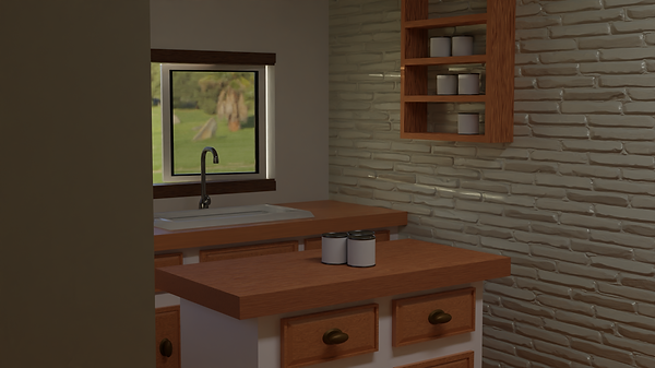
in its mockup stage, to create an atmosphere of nostalgia, i used warm tones in creating the 3d model and rendering of the kitchen.
the 'feel' of the warmth of the kitchen is also inspired by Anton Ego's flashback of him eating her mother's food in Ratatouille


Copyright © 2022 Job Elijander
University of Santo Tomas - College of Fine Arts and Design
bottom of page